
Client: Whitecroft Lighting
Type: Full service (brand illustrations, copy, brochure, sales materials, infographics, print, digital, video).
Creating a sustainability brand
for Whitecroft Lighting
Background
Whitecroft Lighting is one of the UK’s largest manufacturers of commercial lighting. Extraordinarily committed to sustainability and circular manufacturing principles, they consistently push the boundaries of technology to improve theirs and their clients’ impact.
We worked with Whitecroft to create a brand and ongoing campaign rollout for the sustainability and circularity focused areas of their business.

Solution
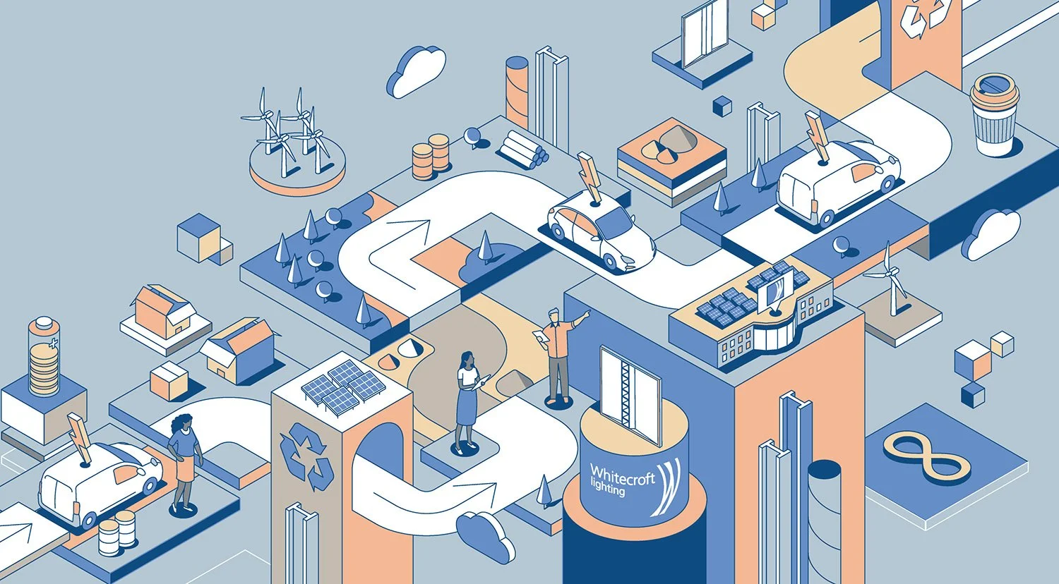
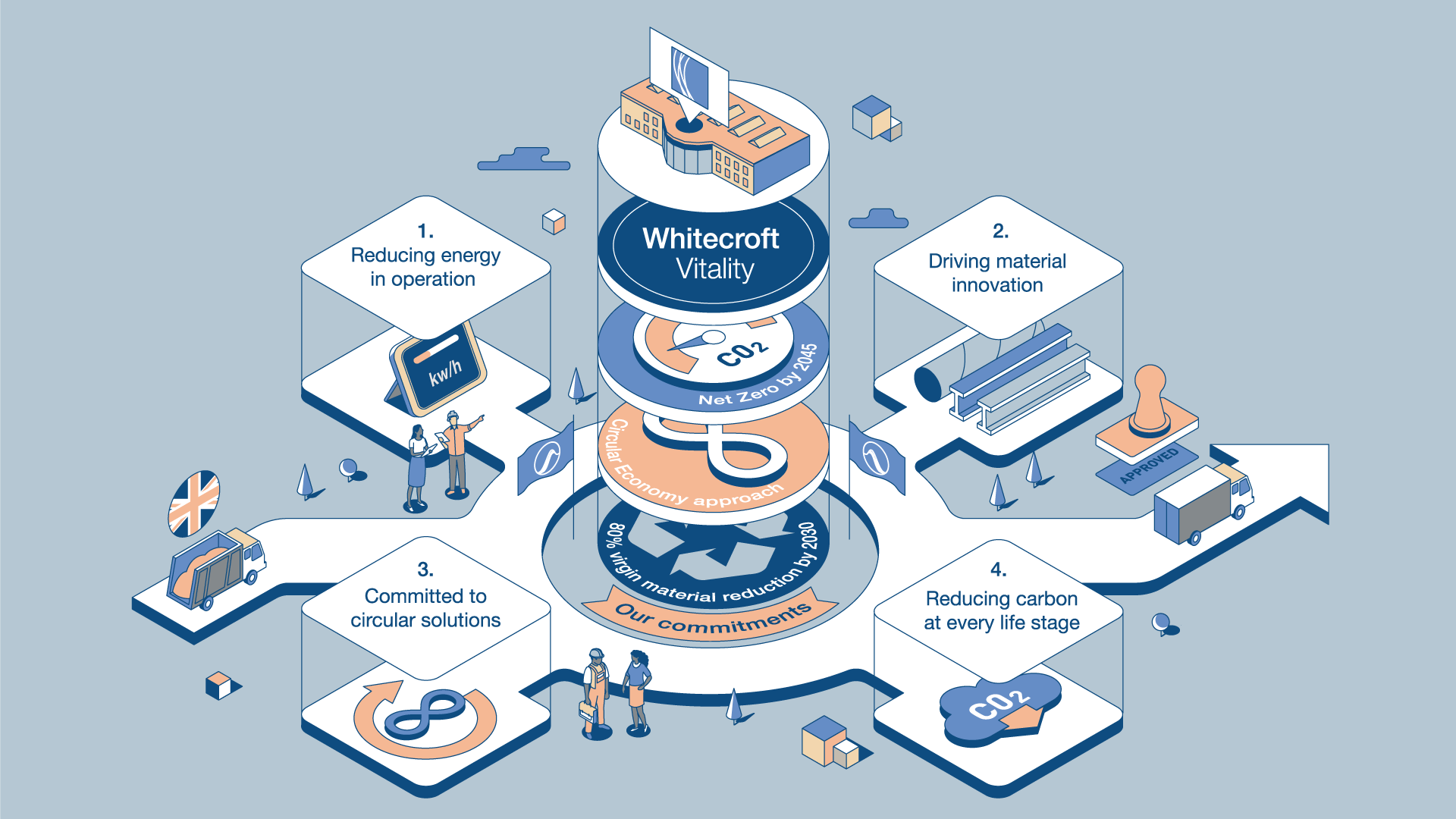
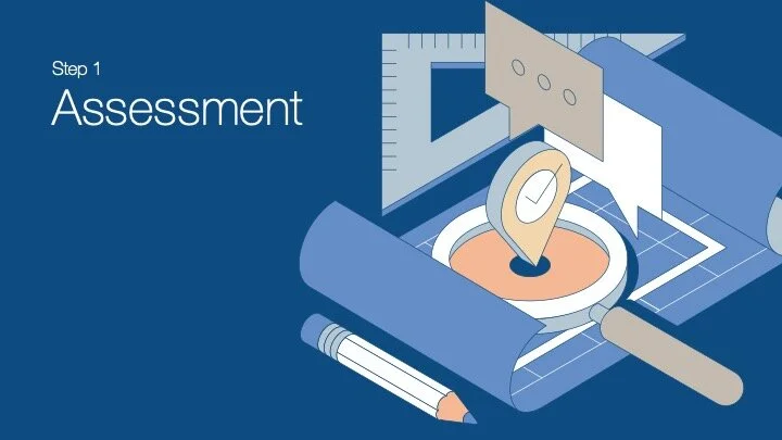
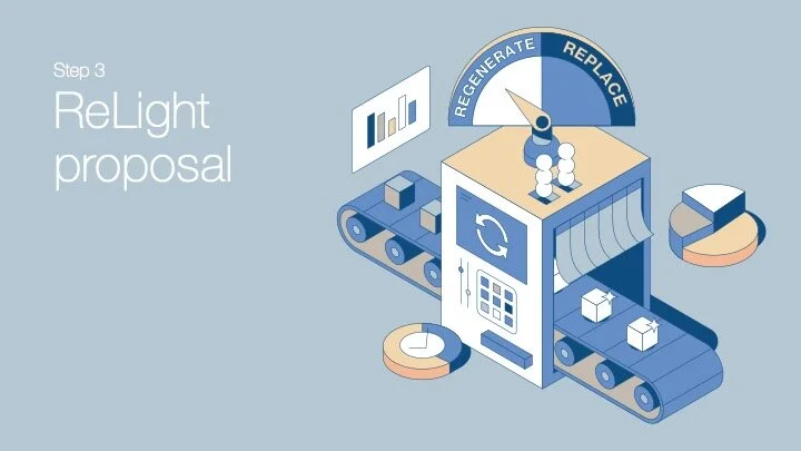
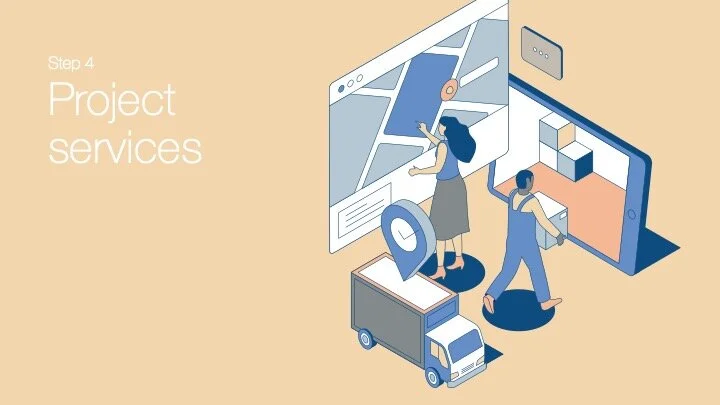
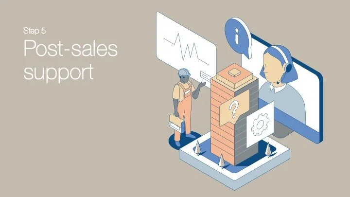
Building an illustrative world
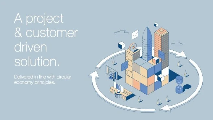
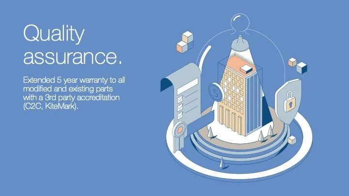
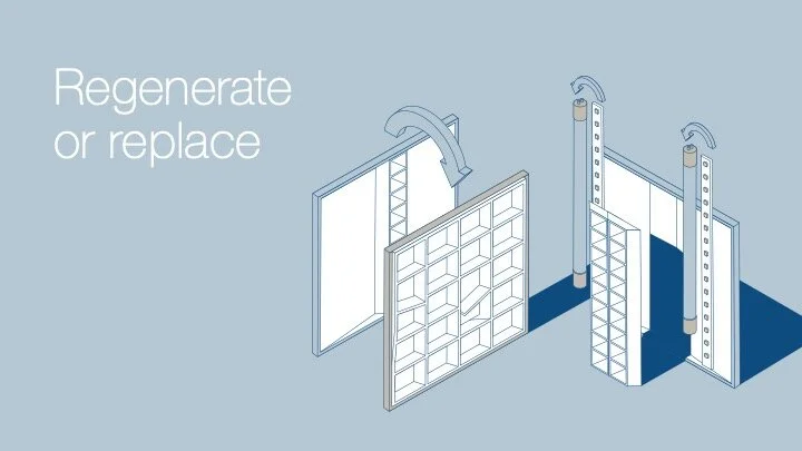
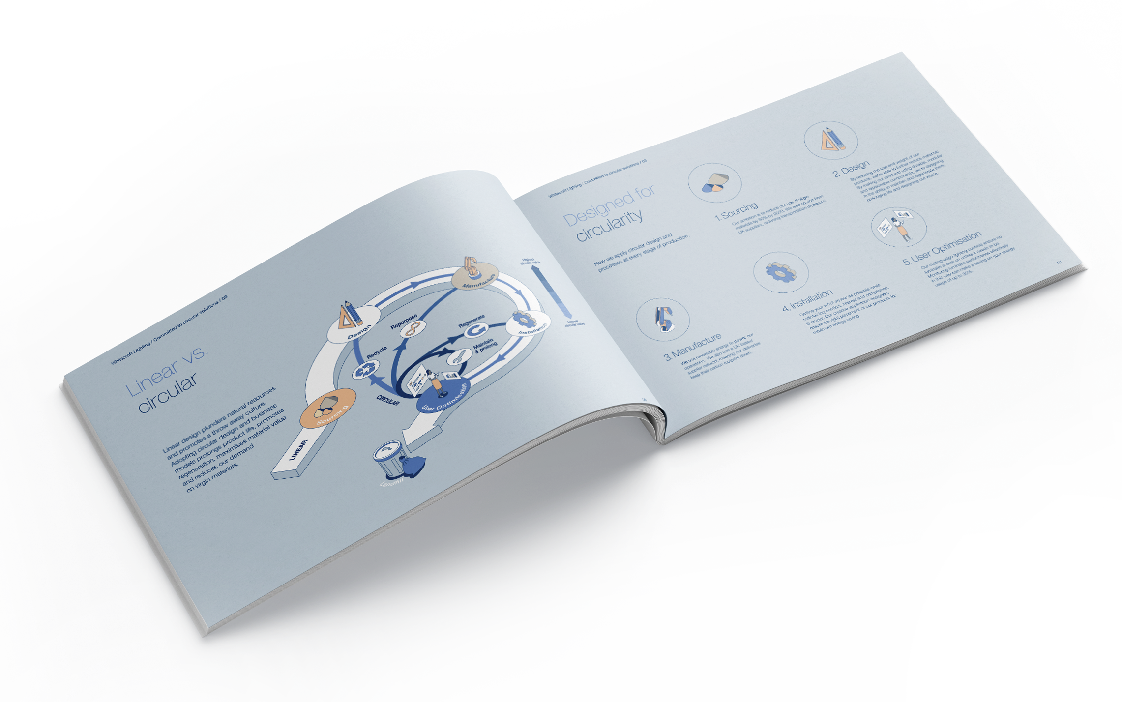
Beautiful visuals drive purchasing. To stand out from competitor campaigns (largely 3D product renders or ultra-chic architecture shots), we saw custom illustration as the way to bring their products and services to life for the audience. A huge bank of assets and environments have been created to capture sustainability and circularity across various campaigns and materials.
One of the major challenges was Whitecroft’s house rule of never using obvious sustainability imagery. No lightbulbs, greenwashing, windmills, or trees allowed!
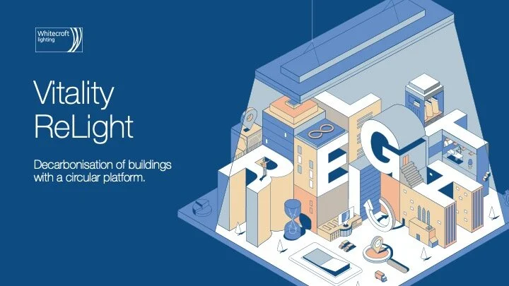
We developed an isometric style which instead features to-the-point imagery like buildings and technology, visually communicating the sustainability benefits without clichés. The aim was not to capture the fine details of how their sustainability range (Vitality ReLight) works or how the products function but to bring to the forefront the very real commitment the business has made to a more sustainable future.
The assets have been designed as a system. They will always work together, in any combination, or as striking standalone pieces, and they can be easily utilised by Whitecroft’s design teams to create additional content later.
Digital and printed materials
The style works seamlessly across print and digital, bringing technical information and sales narrative to life.


30 second animated advert
To compliment the illustrated campaign we developed a 30 second quick-fire typography teaser. This was intentionally designed to give their social audience an immediate sense of the benefits without giving too much away. For example, the main storytelling device is fast paced typography, but we pass through fleeting moments of recognisable lighting products and circularity imagery throughout.
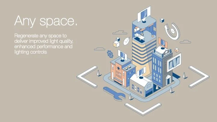
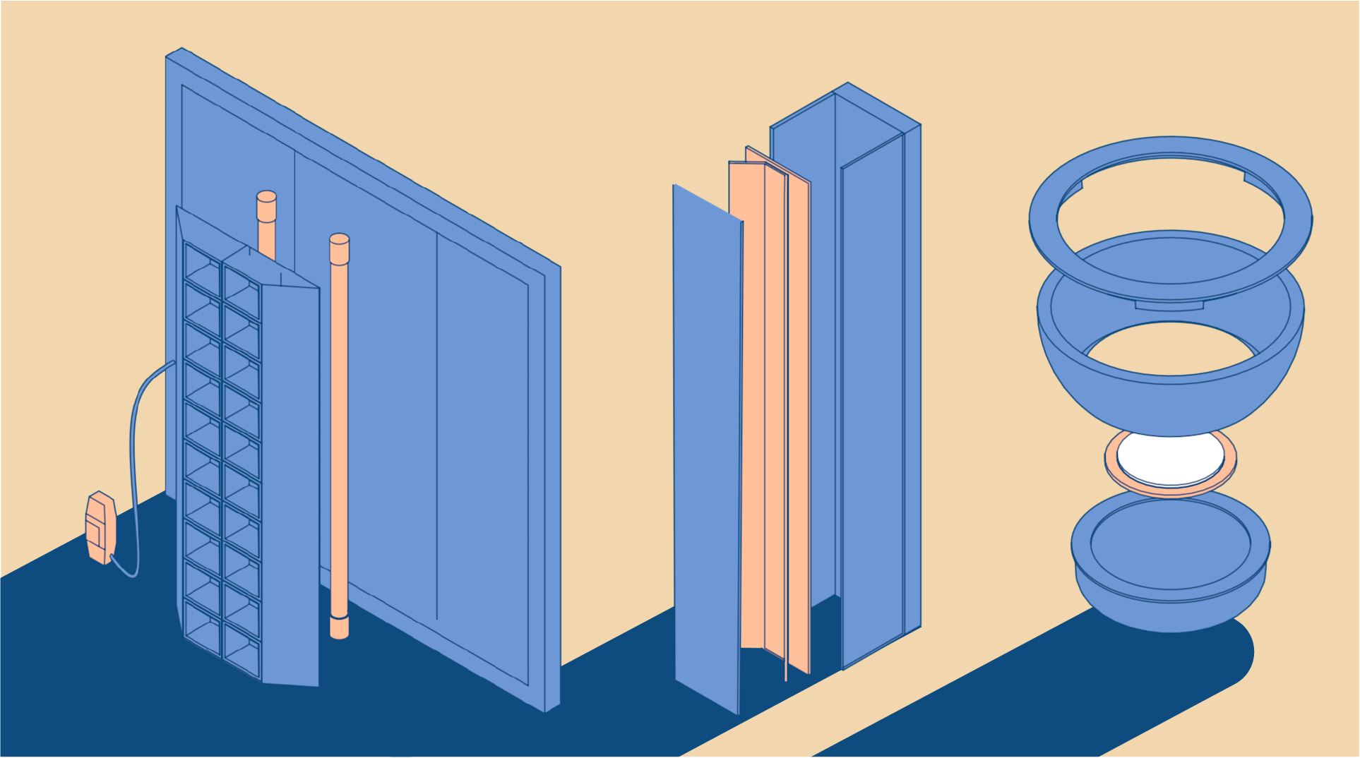
A fresh approach to product visuals
During the creative development process we immediately recognised the importance of true-to-life product visuals. Our isometric approach has allowed us to represent products clearly and effectively through several campaigns and through various sales material (website, printed brochures, decks and more).


Testimonial
“This was our first project working with Next Rebel, they made the whole process from initial briefing through to storyboarding, revisions, and delivery stress free and fun! The team brought our vision to life in a way we could not imagine! Thank you, Next Rebel!”
